
Forum
25 posts
Nintendo Entertainment System, not regular Nintendo font
Which font is this? It is almost "Quantifier NBP". But the E is different and overall it seems the font is too high, but that is a minor problem. Thanks in advance!

Corporatus Suggérée par Apollolux
NES Controller Suggérée par whitespy12
Polices suggérées
Corporatus Suggérée par Apollolux
NES Controller Suggérée par whitespy12
I believe this font was designed exclusively for or by Nintendo. Here's a close recreation font, though it's not an exact match.
Police suggérée : NES Controller
Awesome, very good enough font and it does the job for me!  Thank you for your help whitespy12!
 Thank you for your help whitespy12!
Original is OPTI Limited View.

OPTI Limited View is similar at best conman. Superimpose the OPTI Limited View on the sample image and you will see dramatic differences.
@koeiekat I respectfully disagree. OPTI Limited View is the ONLY digitization of the original phototype used at the time. We're talking 1983. Limited View has been around as early as 1979, possibly even earlier (see "Sans Serif Display Alphabets" by Dan X. Solo, Dover Publications). The only major difference is the R which had an alternate in pre-digital form, as you can see here on the cover for Arthur C. Clarke's Islands In The Sky:

The curves on the inside of the E's and T's are the giveaway for ID. No other typeface comes closer, and I can safely say that Limited View is a much closer match than NES Controller. Comparison image:

Édité 2 fois. Dernière édition le 07/09/2014 à 13:37 par koeiekat
The curves on the inside of the E's and T's are the giveaway for ID. No other typeface comes closer, and I can safely say that Limited View is a much closer match than NES Controller. Comparison image:
Édité 2 fois. Dernière édition le 07/09/2014 à 13:37 par koeiekat
Food for thought

Hey guys, thanks for continuing! Well I'm not great at looking for differences, but I could see that the R is different between original and the Limited View as you sais conman1985. But the A is also somewhat different, not sure if its only the space in the middle pin there, or if there's something more. But that's different at least.
Not saying that the A in Nes Controller is better, I don't! But thats without the space on the middle pin.
But wow, what a difference! Limited View is very, very close *drooling*
Can't find any site that has Limited View either for free or for purchase, so I'm thinking that this font is nowhere to be found? Would be extremely sad as I'm producing, mostly for myself posters with the Nintendo font as I'm in love with retro stuff.
Well I'm not great at looking for differences, but I could see that the R is different between original and the Limited View as you sais conman1985. But the A is also somewhat different, not sure if its only the space in the middle pin there, or if there's something more. But that's different at least.Not saying that the A in Nes Controller is better, I don't! But thats without the space on the middle pin.
But wow, what a difference! Limited View is very, very close *drooling*
Can't find any site that has Limited View either for free or for purchase, so I'm thinking that this font is nowhere to be found? Would be extremely sad as I'm producing, mostly for myself posters with the Nintendo font as I'm in love with retro stuff.
koeiekat
Ah, there's some more difference! I didn't see that the D was different. But E, M and O is well, quite acceptable. Not perfect, but acceptable.. dont you think? The M is just a matter of correction in size.
Ah, there's some more difference! I didn't see that the D was different. But E, M and O is well, quite acceptable. Not perfect, but acceptable.. dont you think? The M is just a matter of correction in size.
Yes, there are a few differences. These are minor. The result of the original 70's phototype having alternate/interchangeable characters that were not digitized. The "Islands In The Sky" sample above shows the alternate R, A, and D. Worth noting that the K in that sample also matches Limited View.
Take a look at the POWER button on the original console:

Notice that the W also matches Limited View.

Also, Airlock (Computer Safari) is a stencil font based on Limited View. Probably too modified to use though.
Édité 2 fois. Dernière édition le 07/09/2014 à 14:13 par conman1985
Take a look at the POWER button on the original console:
Notice that the W also matches Limited View.
Also, Airlock (Computer Safari) is a stencil font based on Limited View. Probably too modified to use though.
Édité 2 fois. Dernière édition le 07/09/2014 à 14:13 par conman1985
Where can I see the Phototype Limited View set, regular and alternates?
The R shown in all images seems to be similar to the Eurostile Bold Extended
The R shown in all images seems to be similar to the Eurostile Bold Extended


Phototype preview of Limited View is from "Sans Serif Display Alphabets" by Dan X. Solo, Dover Publications (1979). There are no other known previews, except the use of it in logos and titles during the 1970's and 1980's when Phototypesetting was prevalent. Eurostile Bold Extended would be an acceptable substitute for the characters that are different. It is likely the inspiration for Limited View anyhow. There are some slight height differences, and you'd need to smooth out some of the inner edges, but I could see it working.
Given that;
a) the NES logo and the Arthur C. Clarke book titles both use these identical alternate characters
b) the nature of phototype is to have an entire typeface on one filmstrip/reel (wasn't easy to change fonts in the middle of typesetting)
and c) the Eurostile characters aren't 100% exact - big image here: https://www.flickr.com/photos/25754471@N08/8652442370/sizes/o/
one must deduce that the original phototype filmstrip came with these alternates.
Take a look at this NES NTF2 Test Cartridge. All the characters, minus the alternate R, D, and F, match Limited View.

Big image of NES Power Pad using numbers from Limited View:
https://img0.etsystatic.com/000/0/5368045/il_fullxfull.336713324.jpg
Édité 6 fois. Dernière édition le 07/09/2014 à 17:15 par conman1985
Have been out for a few hours, so late and you probably fast asleep. Thanks for all the images, I'll play with those. Still, the R, D and so on keep me puzzled. So when (not if) there are those alternates I would like to see just one. As you write, it wasn't easy to change fonts in the middle of typesetting, there must be something out there that shows these alternates.
If (not when) they are there your statement that Original is OPTI Limited View is correct and deserves the
If not, I stick to similar, but no match.
In the mean time
If (not when) they are there your statement that Original is OPTI Limited View is correct and deserves the

If not, I stick to similar, but no match.
In the mean time

OK, the OPTI digital version of Limited View I have is almost identical to the image you have shown conman, nodes may be one to four points of but that is perfectly acceptable. Yet for a perfect match we need the A, D, K, R etc alternate (?). When not I stick to similar but no match, though I admit that it would take less than an hour to make all those. Maybe someone should?
When you read this, Good Morning, have a coffee
When you read this, Good Morning, have a coffee

I think the minor differences are more a result of Castcraft OPTIFonts poor digitization of it. They are not known for producing quality fonts and I would not be surprised if they simply made their version from the sample in Dan X. Solo's 1979 book.
4-Style Digital Font Family:
OPTI Limited View
OPTI Limited View Open
OPTI Limited View Expanded
OPTI Limited View Expanded Open
Just discovered that Roc Mitchell most likely created the original typeface called Logos/Logostyle. We can now do away with the Limited View moniker.
Hopefully, you can see some of it here:
http://web.archive.org/web/20020402084057/http://www.rocmitch.com/rocmitch/fonts/LogoStyle.htm
When Microgramma was designed in 1952 it went on to become a popular typeface to advertise future technology and science fiction. Further revisions in 1962 added a lowercase and it's popularity increased to the point of overexposure. Now named Eurostile, every technology company and corporation was using it. This lead to 1970's designers finding creative ways to make distinct variants that stood out. One such example is Corporate Image/Corporate URW/Paratype Mania (1971, Phil Martin/Roc Mitchell - Alphabet Innovations International, Inc.), which is clearly borrowing from Microgramma/Eurostile, yet offering a sleeker look. Another variant born out of this trend would have been Logos/Logostyle/Limited View.
10-Style Digital Font Family:
Logos
Logos Oblique
LogoStyle
LogoStyle Oblique
LogoText Thin
LogoText Thin Oblique
LogoText
LogoText Oblique
LogoText Medium
LogoText Medium Oblique
From 1970 until 1974, Roc Mitchell designed typefaces for Phil Martin's Alphabet Innovations.
"I did most of my font design work in the 70's, at a time when the process was more photographic than computerized. My son Paul did the computer work necessary to put my type fonts into computer format, learning as he went."
Roc Mitchell, 1999
Roc Mitchell Design
rocmitchell@home.com | rocfonts@rocmitch.com
Other examples of use:
Nikon Coolscan Film Scanners + Accesories
ColecoVision logotype (probably the reason Nintendo chose to use it too)
Tangerine Dream - Exit (1981) album cover
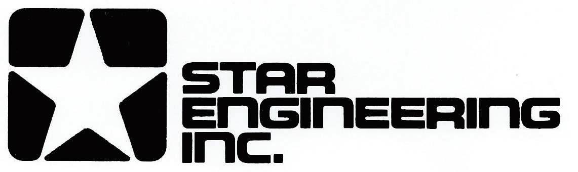
STAR Engineering Inc. logotype (1972)
Édité 7 fois. Dernière édition le 09/09/2014 à 04:49 par conman1985
4-Style Digital Font Family:
OPTI Limited View
OPTI Limited View Open
OPTI Limited View Expanded
OPTI Limited View Expanded Open
Just discovered that Roc Mitchell most likely created the original typeface called Logos/Logostyle. We can now do away with the Limited View moniker.
Hopefully, you can see some of it here:
http://web.archive.org/web/20020402084057/http://www.rocmitch.com/rocmitch/fonts/LogoStyle.htm
When Microgramma was designed in 1952 it went on to become a popular typeface to advertise future technology and science fiction. Further revisions in 1962 added a lowercase and it's popularity increased to the point of overexposure. Now named Eurostile, every technology company and corporation was using it. This lead to 1970's designers finding creative ways to make distinct variants that stood out. One such example is Corporate Image/Corporate URW/Paratype Mania (1971, Phil Martin/Roc Mitchell - Alphabet Innovations International, Inc.), which is clearly borrowing from Microgramma/Eurostile, yet offering a sleeker look. Another variant born out of this trend would have been Logos/Logostyle/Limited View.
10-Style Digital Font Family:
Logos
Logos Oblique
LogoStyle
LogoStyle Oblique
LogoText Thin
LogoText Thin Oblique
LogoText
LogoText Oblique
LogoText Medium
LogoText Medium Oblique
From 1970 until 1974, Roc Mitchell designed typefaces for Phil Martin's Alphabet Innovations.
"I did most of my font design work in the 70's, at a time when the process was more photographic than computerized. My son Paul did the computer work necessary to put my type fonts into computer format, learning as he went."
Roc Mitchell, 1999
Roc Mitchell Design
rocmitchell@home.com | rocfonts@rocmitch.com
Other examples of use:
Nikon Coolscan Film Scanners + Accesories
ColecoVision logotype (probably the reason Nintendo chose to use it too)
Tangerine Dream - Exit (1981) album cover
STAR Engineering Inc. logotype (1972)
Édité 7 fois. Dernière édition le 09/09/2014 à 04:49 par conman1985
Would be nice to see a Logos and Logotext specimen sheet.
Maybe Claude can trace one?
Maybe Claude can trace one?
Tangerine Dream - Exit (1981) album cover looks like Limited View.

Édité le 08/09/2014 à 21:20 par koeiekat
Édité le 08/09/2014 à 21:20 par koeiekat
The font used by Nikon Coolscan Film Scanners + Accesories looks like Limited View

For the fun of it Logotext revival 

Edit kk
On the Star Engineering logo the bottom of A and R are (sort of) the same while on the Signet covers the A has sharp corners (which is not consistent). And thus also the K and P.
As always, the details ask for much more time than the basic shapes.
Anyone has a specimen sheet of the Logos/Logotext?
Édité 2 fois. Dernière édition le 09/09/2014 à 21:49 par koeiekat

Edit kk
On the Star Engineering logo the bottom of A and R are (sort of) the same while on the Signet covers the A has sharp corners (which is not consistent). And thus also the K and P.
As always, the details ask for much more time than the basic shapes.

Anyone has a specimen sheet of the Logos/Logotext?
Édité 2 fois. Dernière édition le 09/09/2014 à 21:49 par koeiekat
Softer corners are common in phototypesetting when the focus is slightly out of alignment. The sharper the focus, the sharper the edges. In some ways phototype is similar to letterpress in that you do not get a 100% accurate reproduction every time. Variations in light and focus, even the quality of the film the phototype is developed on, all add to the analog charm. Watch some 1970's/1980's films with optical titles and you'll see this effect every so often. Whether or not you wish to replicate these softer edges is up to you - though I would say the sample/specimen in Dan X. Solo's "Sans Serif Display Alphabets" is the most accurate. Other samples are just for determining date of creation - which I would estimate is between 1970 and 1972.
Phototype smoothing example - Mircrogramma Bold/Eurostile Extended Bold:

Ad from PC Mag - July 1983

Édité 2 fois. Dernière édition le 10/09/2014 à 20:49 par conman1985
Phototype smoothing example - Mircrogramma Bold/Eurostile Extended Bold:
Ad from PC Mag - July 1983
Édité 2 fois. Dernière édition le 10/09/2014 à 20:49 par conman1985
Fuseau horaire : CEST. Il est actuellement 07:04
