Laurel Or Hardy
Laurel Or Hardy di Norwegian Ink / Design for Dough 
33.414 scaricati Shareware
LaurelOrHardy.ttfNote dell'autore
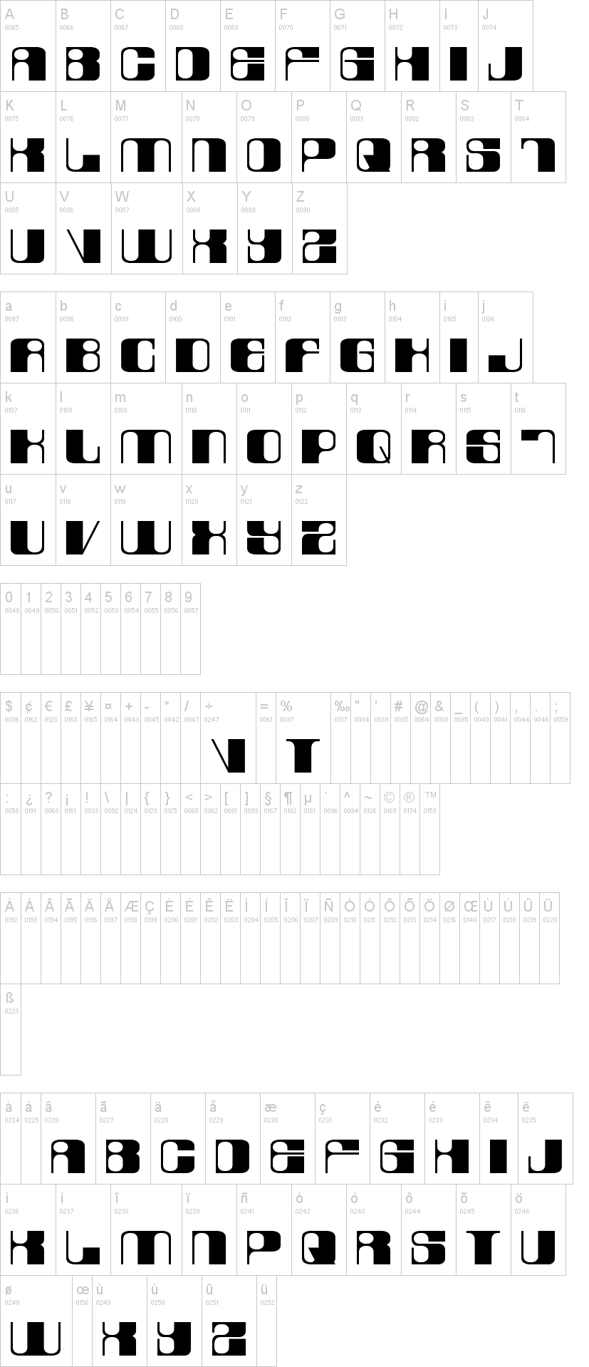
The font consists of 2 variations - lowercase (laurel) & UPPERCASE (hardy).
It was originally designed as a logo-type for our little design agency in Oslo, Norway (see photo illustration). Note that it is based on a strict pattern of vertical thick and thin lines accomplished by shifting between upper- and lowercase glyphs, eg. "desiGN".
If requested we will build punctuation and numerals. For now this is merely a display font.
This is shareware, hence please share a sample screenshot of your publication if you apply this font in your work; we would love to see it (font@norwegianink.com).
Visto per la prima volta su DaFont: 07/09/2009


